Data Visualization
For one of my final courses at American University I wanted to test the boundaries in which we see data visualization on all three dimensions. With that being said, I partook in an independent study in which I visualized how many times I had laughed in a three day time period in three separate ways: a 2D drawing, a 3D video, and an AR Sculpture. So, how many times does the average person laugh in one day?
Step 1: Get The Data
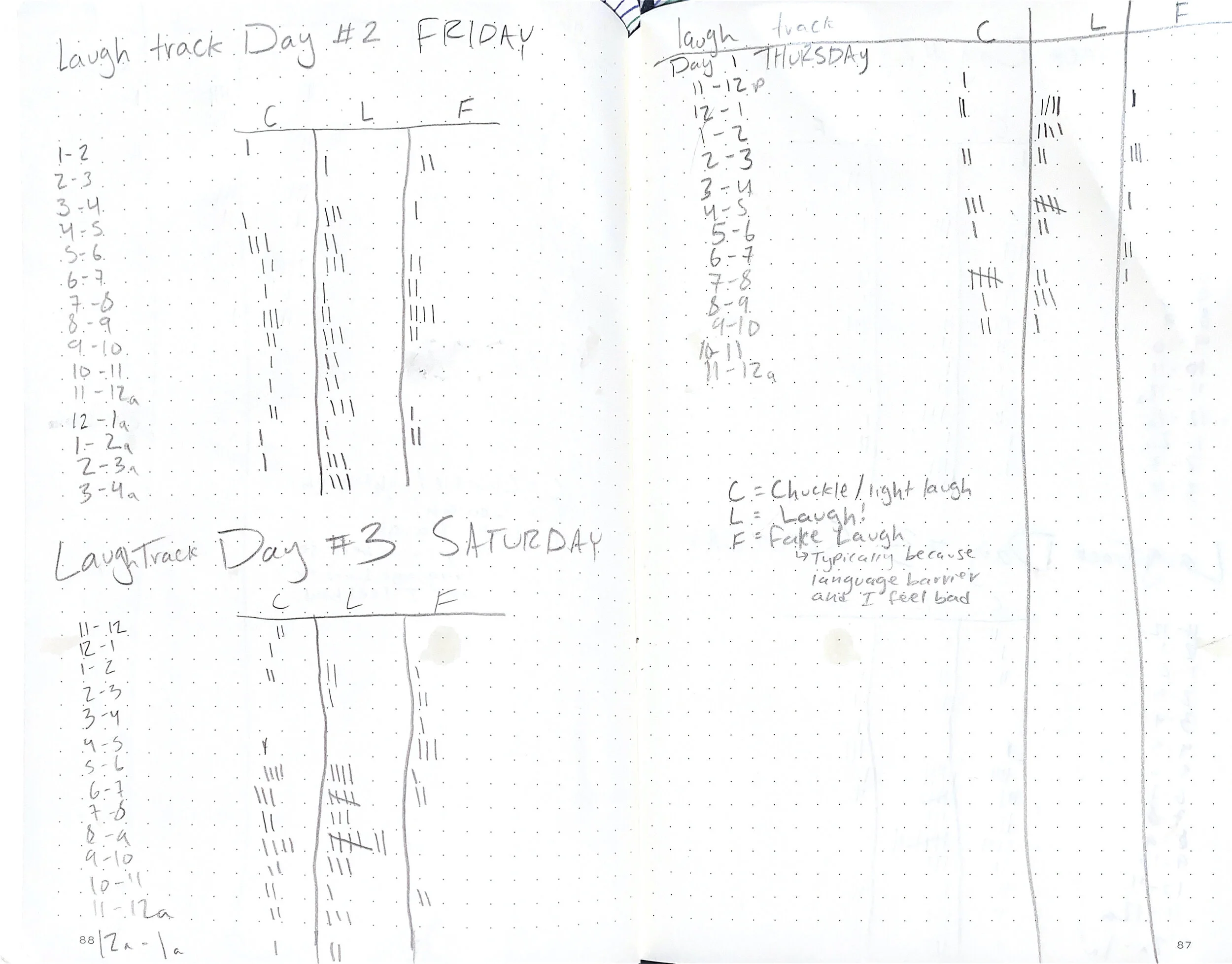
One of the first steps in any data visualization project to get the numbers. In one weekend, I tested myself to try and collect a note of each time I laughed and categorized it by what time it happened and what type of laugh it was: Laugh, Fake Laugh, or Chuckle.
Step 2: Visualize the Data
For the first step of visualization I wanted to keep it more literal to understand any trends that there may be within my data. I essentially took inspiration from sonar waves and layered the data on points with colors corresponding to what kind of laugh happened at what time. By using this I was able to understand that, per obvious reasons, the middle of the day produced the most laughs for me.
Step 3(D): Pushing Data to Exist on Three Dimensions
Flower Visualization
From here, I wanted to see how I could test my self-taught skills of 3D rendering. First using a geometric flower structure, I created a visualization that showcases each petal to correspond to the data I collected. Each flower represented one day and allowed each day to be compared through the visuals of the flowers themselves.


